Button~
obj:btn
| Property | Value | Default | Description |
|---|---|---|---|
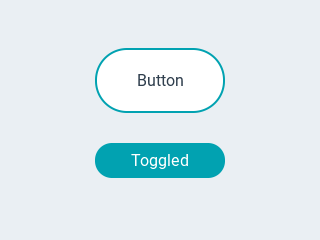
| toggle | bool | false | When enabled, creates a toggle-on/toggle-off button. If false, creates a normal button |
| val | int16 | 0 | The value: 0 = untoggled, 1 = toggled |
| text | string | "" | The text of the label |
| mode | string | expand |
The wrapping mode of long text labels.expand Expand the object size to the text sizebreak Keep the object width, break the too long lines and expand the object heightdots Keep the size and write dots at the end if the text is too longscroll Keep the size and roll the text back and forthloop Keep the size and roll the text circularlycrop Keep the size and crop the text out of it |
| align | string | left |
Text alignment: left, center, right |
Examples~
Similar to the text label, it's possible to set the color of characters in the text indvidually, just prefix the text to be re-colored with a #RRGGBB hexadecimal color code and a space, and close with a single hash # tag.
Example jsonl
1 2 | |
Events~
Push Button~
Normal buttons (toggle=false) send touch events while they occur:
Short touch:
1 2 | |
Long press:
1 2 3 4 5 | |
Toggle Button~
Toggle buttons (toggle=true) send out the old value in the down event and the new value in the up event when released:
Toggle ON:
1 2 | |
Toggle OFF:
1 2 | |